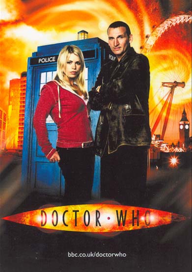
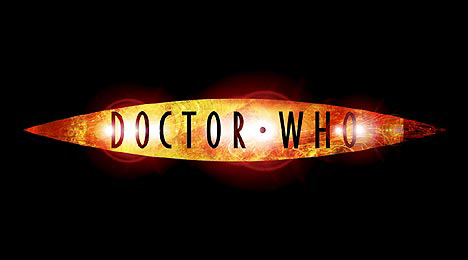
Ahead
of the official announcement of the New Series launch date/time, the new 21st
century DOCTOR WHO logogram has been revealed on the official WHO website.
About
the size of RIZLA packet, the lozenge-shaped design is...well, if it ain't broke
don't fix it.
Five
people have worked on it, with the initial contribution of Russell T Davies scribbled
on the said cigarette papers packet, for several months. And this is it.
RTD
has got it wrong.
In
1996, DOCTOR WHO branding adopted the Pertwee-style logo to
solid effect, consolidating the heritage and awareness of the series across print,
on-line and audio-visual material. A strong logo design that works at varying
sizes from 1cm to 1M in size. It's not gimmicky, subject to 'design-fashion'
or the whims of graphic designers.
This
new design has the naive overtones of the McCoy season's logo, which lacked style
and substance.
If
necessary, the branding for the New Series should have adopted the Pertwee style
logo, changing the colour to orange.
If
nothing else, at least the new design has used the EOH colour
scheming of reds, orange and black. Thanks. |